Improving the UI of Edorado8s


Architect a holistic, scalable, and high-performance solution that would serve as the foundation for all future internal engineering tooling.
UX/UI Designer & Systems Architect (Graduation Internship)
The new 'application shell' and design system were adopted as the new standard, leading to a 40% reduction in front-end inconsistencies and measurably reduced task completion time.
The internal engineering tools had developed organically, creating significant operational drag. This fragmentation caused high cognitive load for operators (e.g., UIs with 10+ tabs), high technical debt for developers, and was a direct business bottleneck, making it slow and expensive to scale.
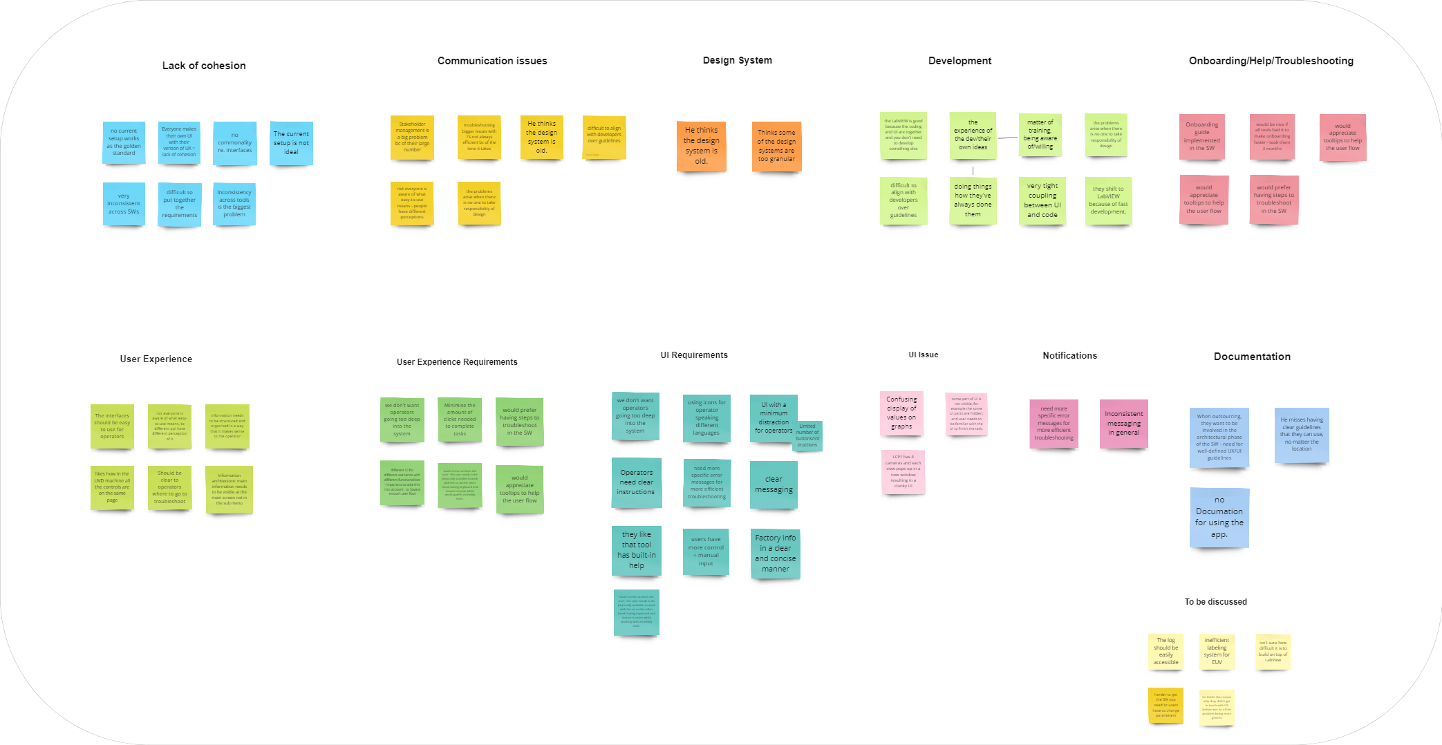
Before making any design decisions, it was crucial to understand the real challenges. Many existing UIs were designed without direct user input. I conducted 15+ interviews, observed real-world usage on-site, and analyzed interaction videos to uncover hidden inefficiencies.
💡 Key Insight:
These findings formed the foundation for all design decisions. By understanding how users interact with the tools, I was able to address real issues rather than assumptions.
Without clearly defining the core challenges, design efforts could lose focus. Analysis revealed core UX challenges like UI inconsistency, poor error handling, and inefficient workflows, which manifested as the '10-Tab Monster' UI.
💡 Key Insight:
My most significant shift was from 'problem-solving' to 'problem-framing.' The initial request was for 'UI consistency,' but my analysis revealed the real problem was a broken Information Architecture.
A single solution might not work for every use case. I explored multiple approaches, including a modular UI design, improved navigation hierarchy, and a new error feedback system. The modular design was chosen for its consistency, reusability, and scalability.
💡 Key Insight:
The modular design approach was selected because it ensures consistency, allows engineers to reuse components, and scales efficiently.
A prototype allows users to interact with the design and provide feedback before full implementation. I delivered a final UI for a specific tool (ULS), a complete design system, and a Proof of Concept (PoC) using React and gRPC to decouple the UI from LabVIEW.
💡 Key Insight:
The PoC proved that decoupling the UI from LabVIEW was feasible, enabling a more flexible and modern front-end stack for the future.
Operators and Engineers tested the prototype. Feedback confirmed the UI was easier to navigate, error messages were clearer, and the elements were more consistent. Developers appreciated the structured design system for handoff.
💡 Key Insight:
The testing phase confirmed that the design system improves usability, and operators completed tasks faster with fewer errors.
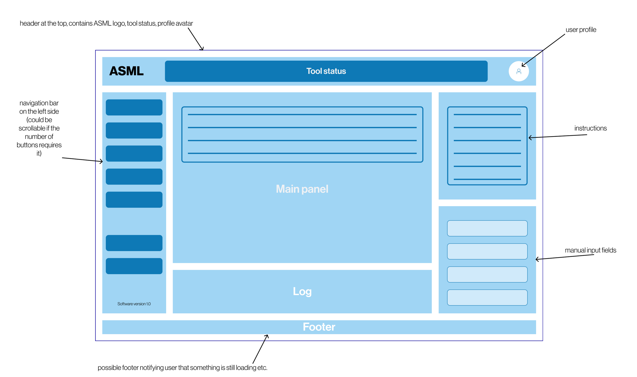
Instead of cosmetic changes, the solution was a unified 'application shell' and a systemic design system. This standardized framework created a consistent, predictable, and modular structure for all tools.
A standardized framework with a static header, persistent left navigation, and a global footer, liberating the main content panel.
Replaced the '10-Tab Monster' by redesigning core functions as independent widgets (Instructions, Logs) on a single, customizable screen.
A 'Flip Phone' concept using Material Design principles where modules intelligently reflow when one is expanded, scaling to large monitors.
A tokenized and componentized Figma system allowing engineers to mock up new, compliant tools in minutes by reusing pre-approved modules.


